Plot Antarctic Co-tidal Charts
This notebook demonstrates plotting co-tidal charts for selected constituents around Antarctica. A co-tidal chart visualizes both the tidal constituent amplitude and phase (as contours) as a single map, and are good for visualizing amphidromic points.
Important
Need to download tide model prior to running this notebook.
OTIS format tidal solutions provided by Oregon State University and ESR
Global Tide Model (GOT) solutions provided by Richard Ray at GSFC
Finite Element Solution (FES) provided by AVISO
Python Dependencies
Program Dependencies
astro.py: computes the basic astronomical mean longitudesconstituents.py: calculates constituent parameters and nodal argumentsio.model.py: retrieves tide model parameters for named tide modelsio.OTIS.py: extract tidal harmonic constants from OTIS tide modelsio.ATLAS.py: extract tidal harmonic constants from ATLAS netcdf modelsio.GOT.py: extract tidal harmonic constants from GOT tide modelsio.FES.py: extract tidal harmonic constants from FES tide modelspredict.py: predict tidal values using harmonic constantsutilities.py: download and management utilities for files
Note
This notebook uses Jupyter widgets to set parameters for calculating the cotidal maps.
Load modules
import numpy as np
import xarray as xr
import matplotlib

matplotlib.rcParams["axes.linewidth"] = 2.0
import matplotlib.pyplot as plt
import cartopy.crs as ccrs

# import tide programs
import pyTMD.io
import pyTMD.predict
import pyTMD.tools
import pyTMD.utilities

# autoreload
%load_ext autoreload
%autoreload 2
Set parameters for program
Model directory
Tide model
# available model list
model_list = sorted(pyTMD.io.model.ocean_elevation())
# display widgets for setting directory and model
TMDwidgets = pyTMD.tools.widgets()
TMDwidgets.model.options = model_list
TMDwidgets.model.value = "GOT4.10_nc"
TMDwidgets.VBox(
    [
        TMDwidgets.directory,
        TMDwidgets.model,
    ]
)
Open tide model
# get model parameters
model = pyTMD.io.model(
    TMDwidgets.directory.value,
).from_database(TMDwidgets.model.value)
# open dataset
ds = model.open_dataset(group="z")
Select constituent for cotidal chart
c = sorted(ds.tmd.constituents)
TMDwidgets.constituents.options = c
TMDwidgets.constituents.value = c[0]
display(TMDwidgets.constituents)
Setup coordinates
# create an image around Antarctica
xlimits = [-560.0 * 5e3, 560.0 * 5e3]
ylimits = [-560.0 * 5e3, 560.0 * 5e3]
spacing = [20e3, -20e3]
# x and y coordinates
x = np.arange(xlimits[0], xlimits[1] + spacing[0], spacing[0])
y = np.arange(ylimits[1], ylimits[0] + spacing[1], spacing[1])
xgrid, ygrid = np.meshgrid(x, y)
# create xarray DataArrays for coordinates in crs of model
X, Y = ds.tmd.coords_as(xgrid, ygrid, type="grid", crs=3031)
Calculate tide map
# interpolate tide model to grid points
ds1 = ds.tmd.interp(X, Y)
# convert to centimeters
ds1 = ds1.tmd.to_units("cm")
# assign original x and y coordinates to dataset
ds1 = ds1.tmd.assign_coords(x=x, y=y, crs=3031)
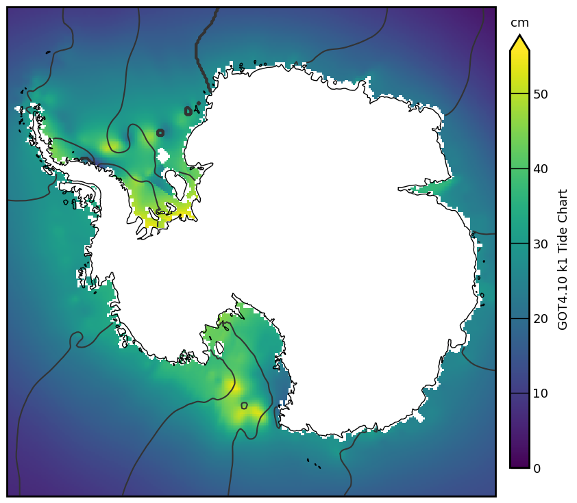
Create cotidal chart
# extract amplitude and phase for constituent
cons = TMDwidgets.constituents.value
amplitude = ds1[cons].tmd.amplitude
phase = ds1[cons].tmd.phase

# plot Antarctic cotidal charts
projection = ccrs.Stereographic(
    central_longitude=0.0,
    central_latitude=-90,
    true_scale_latitude=-71.0,
)
fig, ax = plt.subplots(
    num=1, figsize=(9, 8), subplot_kw=dict(projection=projection)
)
# plot tide amplitude
im = amplitude.plot(ax=ax, vmin=0, add_colorbar=False, transform=projection)
# plot tide phase
contour_levels = np.arange(0, 360, 30)
phase.plot.contour(
    ax=ax,
    levels=contour_levels,
    colors="0.2",
    linestyles="solid",
    transform=projection,
)
# add moderate resolution cartopy coastlines
ax.coastlines("50m")

# Add colorbar and adjust size
# pad = distance from main plot axis
# extend = add extension triangles to upper and lower bounds
# options: neither, both, min, max
# shrink = percent size of colorbar
# aspect = lengthXwidth aspect of colorbar
cbar = plt.colorbar(
    im,
    ax=ax,
    pad=0.025,
    extend="max",
    extendfrac=0.0375,
    shrink=0.85,
    aspect=22.5,
    drawedges=False,
)
# rasterized colorbar to remove lines
cbar.solids.set_rasterized(True)
# Add label to the colorbar
cbar.ax.set_ylabel(f"{model.name} {cons} Tide Chart", labelpad=10, fontsize=13)
cbar.ax.set_title("cm", fontsize=13, va="bottom")
# ticks lines all the way across
cbar.ax.tick_params(
    which="both", width=1, length=20, labelsize=13, direction="in"
)
# set x and y limits
ax.set_xlim(xlimits)

# stronger linewidth on frame
ax.spines["geo"].set_linewidth(2.0)
ax.spines["geo"].set_capstyle("projecting")
# adjust subplot within figure
fig.subplots_adjust(left=0.02, right=0.98, bottom=0.05, top=0.98)

# show the plot
plt.show()